Partner Article
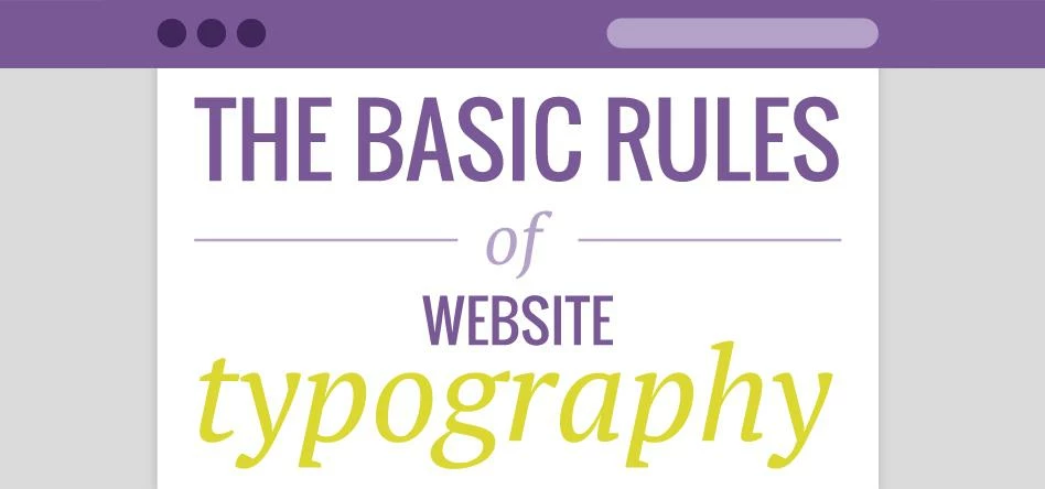
Basic Rules of Website Typography
Basic Rules of Website Typography
Aside from looking at all of the pretty pictures, the main reason a user visits your website is to read through your content. Providing them with an effortless, efficient and pleasurable experience is essential to keeping them interested in what you are saying.
In simple terms, typography is the way in which you arrange and display your type throughout your website. There are numerous ways in which you can use typography to provide the best visual experience for your viewers:
Choose the right fonts
Choosing the right fonts, whether for web or for print is hugely important. The font you use will visually and immediately set the tone of your design and give it character, by picking an unsuitable font you risk creating the wrong first impression.
To put it simpler, choosing the wrong font for your site is like turning up at a wedding reception in shorts and t-shirt. Yes they still function as clothes but the outfit is completely inappropriate for the occasion and creates the entirely wrong impression.
There are many things to consider when choosing a font: Does it match the purpose of the message you are trying to get across? Will it be used as a headline or in large areas of body copy? Will it be viewed at small sizes?
Although there are no definitive rules when picking a font, asking yourself these questions first will help you on your way.
Limit your fonts
[Don’t use too many fonts] As a general rule, don’t use too many fonts on your site, less is definitely more. There are always exceptions but in most cases choosing 1 or 2 suitable fonts is best practice. Not only will this help the design but it will also help with page load speed, as using a large number of web fonts will increase the time it takes for page content to load.
Combining fonts can sometimes prove to be quite difficult. Ideally the fonts should complement each other yet still provide a contrast, making sure that they are not too similar but not too different that there is no cohesion whatsoever. It may take a little trial and error to get the combinations right.
Create a hierarchy
Every well-designed site has a clear and structured hierarchy of content. As websites are more commonly scanned and not read thoroughly, your use of typography will determine your hierarchy and guide the viewer throughout your website as efficiently as possible, directing them where to start reading and where to navigate to next.
Main headlines should be much bigger and catch your eyes first. Sub-heads should be clearly identifiable from the body copy and break up large areas of body copy by using pull quotes to create a more dominant position for important information.
Alignment
The alignment of your text has a huge impact on how readable your content is and how easy viewers can navigate their way around your site. It needs to flow correctly and guide a viewer down a page.
For example, centre aligning large areas of text can make it very taxing to read whereas left aligned text allows the readers eyes to flow a lot easier over a block of text as the starting point of each line is always in the same position.
Text colours
Be careful when choosing the colour for your text and make sure that it has enough contrast from the colour of the background. This will depend on how much text there is and how large the font is. For example, black on white is perfect for areas of small body copy.
Limit the number of colours you use throughout your site. Again, there is no definite rule for this and each site is different, but normal practice would be to use between 3 and 5 colours. Using more would create a lot of inconsistency and possible confusion for the visitor which may result in them skimming over important information.
This was posted in Bdaily's Members' News section by Carl Buckley .
Enjoy the read? Get Bdaily delivered.
Sign up to receive our popular morning National email for free.
Our Partners


 What next when social media career help goes?
 The psychological contract that nobody signs
 Time for strategy built on the foundational economy
 Why being ‘work-ready’ matters more than ever
 The North's future doesn't end at Manchester
 Exit or legacy? Why every owner needs a plan
 Who speaks up for SMEs when giants get bigger?
 The true value of HR in an AI-driven working world
 What new business rates guidance means for pubs
 Business success starts with people investment
 It's time to confront the digital poverty crisis
 Why a business exit is no longer all or nothing