Partner Article
Analysing the new look for ITV
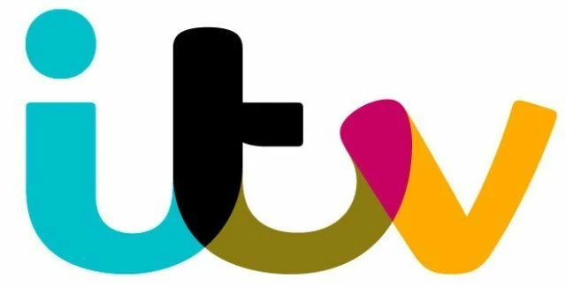
ITV have a new logo, which obviously makes headline news in our world. This should be easy as no one was in love with the old one, but of course it isn’t. Just like the Olympics logo, the general public won’t want anything too different, it seems much easier to criticise a design than to find positives.
When a brand change comes around, it usually follows a change in the organisation or company. What’s changed? The programming features a new line, there are less documentaries and more shows like TOWIE, Take Me Out and Britain’s Got Talent. This brings a colourful vibrant logo, less serious and a lot of fun. To me however, I can’t help feel that this logo should be placed further back in the channel list, it just doesn’t scream main channel. What I do like about this brand is the fact that it is dynamic, colours change to certain programmes and adverts. The way it changes for the different channels isn’t mind blowing, but the CITV logo does work particularly well.
The main headlines with the change have nothing to do with the look, this was dominated by a very minor change in name, ITV 1 is now just ITV, which it was originally. This is surprising, as you would think no one would notice.
Of course with any rebrand as big as this, a font isn’t found, it is created. Although this looks less bespoke and pretty similar to most modern fonts, but because of this there isn’t anything objectionable about it. The font is called ITV Reem (named after the term ‘reem’ from TOWIE).
Compared to the last logo, which didn’t stretch the imagination. This chameleon of a logo will be easy to work with and as it is rolled out across the media, the public may grow to like this in time.
This was posted in Bdaily's Members' News section by Urban River .
Enjoy the read? Get Bdaily delivered.
Sign up to receive our daily bulletin, sent to your inbox, for free.
Our Partners


 The psychological contract that nobody signs
 Time for strategy built on the foundational economy
 Why being ‘work-ready’ matters more than ever
 The North's future doesn't end at Manchester
 Exit or legacy? Why every owner needs a plan
 Who speaks up for SMEs when giants get bigger?
 The true value of HR in an AI-driven working world
 What new business rates guidance means for pubs
 Business success starts with people investment
 It's time to confront the digital poverty crisis
 Why a business exit is no longer all or nothing
 Culture is the foundation for sustainable growth