Partner Article
What makes a good company logo?
Choosing the right kind of logo for your business is an integral part of building a strong business or organisation and is essential in creating a strong brand identity. Well constructed and thought out logos create an excellent base for brand recognition.
The foundations in creating a brand should come from the values, beliefs and functions of the business. A logo is the visual representation of these values, beliefs and functions as this is generally the first point of recognition for your clients.
A design team may approach your logo with several different kinds of logos in mind. These can be loosely grouped into the following three categories:
1. Word mark Generally speaking this is the most preferred option for a logo, especially if your brand isn’t well established. Word marks are uniquely styled logos, which are exclusively typographic and spell the brand name or company out.
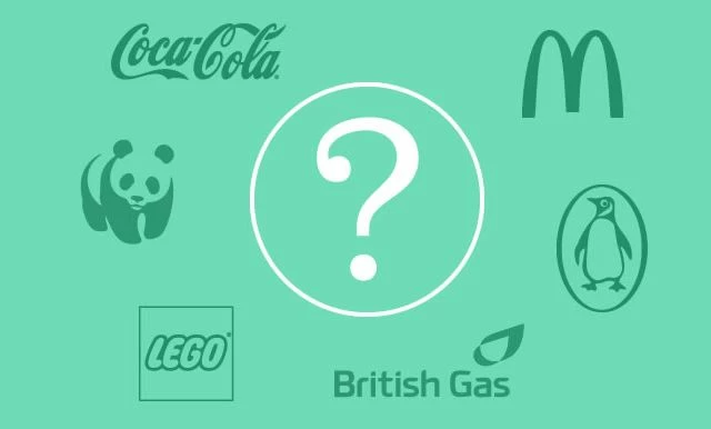
Examples of this type of logo include Coca Cola, Sony and FedEx.
2. Symbol/ Icon (Pictorial/Abstract/Letter mark) A symbol, whether it’s pictorial, abstract or a letter mark, creates an easily recognisable motif. Usually, the ideas behind the logo are complex, but the logo represents the brand in its simplest form.
Examples of recognisable pictorial symbol logos include Apple, WWF and Penguin Books.
Abstract symbol logo designs are usually influenced by nonfigurative influences. Examples include Nike, BP and Adidas
Letter marks are probably the most simple and easily memorable symbolic logos as generally there isn’t anything arbitrary about the design. These types of logos are usually favoured over other types of symbolic logo as they can easily graphically illustrate the company better than the full name, especially if the company name is difficult to pronounce or if it’s not very distinct.
Examples include McDonalds, Hewlett-Packard and Calvin Klein.
3. Combination Mark (Traditional/ Emblem) A traditional combination mark occurs when a word mark is coupled with a symbol. Logos that use combination marks are commonly flexible and aid towards a more interesting brand identity. Examples include Jaguar, British Gas and National Trust.
Emblem combination marks are similar to traditional combination marks. However, they rely heavily on the typography within the encasing emblem since without the typography the logo is generally unrecogniseable. Examples include Starbucks, Lego and Harley Davidson.
There are a lot of different choices that need to be made in order to help build a strong foundation for your brand identity. Ultimately, a good designer will work with you to understand your company and will choose the appropriate logotype based on the values, beliefs and functions of your business.
This was posted in Bdaily's Members' News section by JUMP UP LTD .
Enjoy the read? Get Bdaily delivered.
Sign up to receive our daily bulletin, sent to your inbox, for free.
Our Partners


 Why local government is key to devolution success
 Your reputation is worth more than that invoice
 There is no perfect time when selling a business
 What next when social media career help goes?
 The psychological contract that nobody signs
 Time for strategy built on the foundational economy
 Why being ‘work-ready’ matters more than ever
 The North's future doesn't end at Manchester
 Exit or legacy? Why every owner needs a plan
 Who speaks up for SMEs when giants get bigger?
 The true value of HR in an AI-driven working world
 What new business rates guidance means for pubs