Partner Article
Five ways to get more out of visualisation
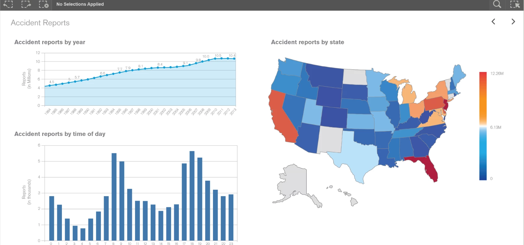
In the world of business intelligence and visualisation, it has never been truer that a picture is worth a thousand words. When used properly, rather than just being an aesthetic adaptation, expressing quantitative data visually can provide a valuable method of extracting meaning and therefore critical business insights from data sets. In a rapidly changing market, this type of insight is crucial for companies looking to improve the operations of their businesses and enter a new phase of growth.
Although charts have been used by companies for decades, as data sets increase in complexity, they are simply not sophisticated enough to allow users to extract real insights. Organisations need to move towards more detailed and interactive visualisation method which enables users to spot outliers, patterns, trends and correlations in complex data. However, to truly experience the benefits of cutting-edge data visualisation, there are five things organisations should consider if these platforms are to deliver maximum impact for their business.
Be selective of what you’re trying to achieve
Often the first mistake for data visualisation teams is that they cast the net too wide. They want their graphics to represent too much information and, as a result, the visualisation becomes too crowded. A good visualisation represents a small number of measures - preferably no more than seven to nine, as that is all that users can cover at once.
Similarly, be specific with the number of KPIs you want represented in the dashboard – again, keep it to nine or less. After all, too many indicators are distracting. Keep the visualisation simple. The less there is to interpret, the easier it is for the user to understand. If your visual looks cluttered, try a different format. The cleanest format is usually the best.
Another principle is to make sure the format of the information is appropriate for the use case and the user. Chart formats, for example, come in many types and are often preferred by business users. Edward Tufte, a leading academic, talks a lot about “chart junk” which is the complexity that people sometimes put onto a visualisation that can obscure the meaning. So when you create charts, use as little ink or pixels as possible to maximize the data.
Choose an appropriate chart type for the data
Be aware of which type of chart you should use and which one will best display the data and also fit your audience who will be looking at it. We’re all familiar with line charts, area charts and pie charts but sometimes certain visualisations are not appropriate.
Pie charts for example are a common format for displaying information, but they are controversial in the world of visualisation. It is extremely difficult to compare one pie chart to another yet they are used in that way all the time. Use them, but use them appropriately, and only to show a relatively small series of data.
Become familiar with the wide range of visual tools at your disposal and then choose them wisely based on the overall desired outcome.
Using color and perception
The use of color and perception is very important in visualisation and many organisations misuse it. Using color well can enhance and clarify a chart so that the users can get the highlights of the data. Color used poorly will confuse the user and obscure the data. For example, you can use color to highlight positives or negatives or show how the data changes over time or with different variables.
However, remember when using colors that analysis should always come first. Many companies fall into the trap of using their brand colors in visualisations but these are often not the best option. Businesses should consider what messages and insights the coloring is trying to convey and make an appropriate choice based on this rather than what the branding department has to say.
Finally color blindness is a consideration; don’t rule these people out as users. You shouldn’t use color alone to transmit meaning if at all possible. Use shapes or use appropriate colors that most everyone can see.
Choose your data sets carefully
Great visualisations start with great data and will only be as useful as the quality of the data it represents. Sometimes when teams receive unexpected results from their visualisations they can’t understand why and their BI tools can end up taking the blame. However, this shouldn’t be the case.
Instead, visualisation tools should be used to help spot these issues early so they can be corrected in time to not affect the entire project. This can often be helped from an end-user perspective by being able to identify the difference between an unexpected discovery and a data issue.
Just try it
And finally, just try it. Let your users interact with the visuals where there is a pressing need for it, perhaps in a department with geographic requirements.
Overall, data visualisation has the capacity to really turn around the way your organisation is using – and benefitting from – its data, but only if it’s being used in the most effective way possible. Napoleon is right – a picture is worth a thousand words – but only if that picture is displayed to help you understand a situation and act accordingly.
This was posted in Bdaily's Members' News section by Sean Farrington .








 The rise of an alternative investor model
 Bots don't beat personal business coaching
 From COVID-19 to the Middle East crisis
 How to build credibility in B2B marketing
 Is your business ready for the trade union change?
 Government 'must take its foot off businesses' throats'
 Upskilling key to civil engineering's future
 Why apprenticeships are becoming a strategic asset
 Business growth requires the right environment
 OpenAI decision a wake-up call for our tech plans
 Understanding the new Employment Rights Act
 Why global conflict is a cyber risk for UK SMEs