Partner Article
Parker Williams redesigns Rachel’s yogurts
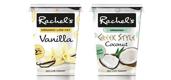
Branding and packaging design specialist Parker Williams has redesigned the packaging for the entire 40-strong range of Rachel’s yogurts.
This is the brand’s first redesign in five years and Parker Williams’ task was to evolve the look to better express the positioning of the genuine pleasurable taste and also build people’s emotional connection to the brand. The updated packaging focuses on the gorgeousness of real fruit and the creamy texture of the yogurt. Hand-scripted lettering emphasises the personal touch and link to Rachel herself and the brand story.
Parker Williams used its ‘Bright ID’ tool to help determine Rachel’s core visual equities, explore which elements needed to evolve and where the opportunities lay. The original circles motif has been retained but updated to provide colour coding for the range; clearer hierarchy of communication on pack and architecture across the range has been introduced to help shoppers make their choice in store.
Daniel Wheeler, marketing manager at Lactalis Nestle Chilled Dairy, said “Parker Williams has done an outstanding job in redesigning the Rachel’s range - this was our first refresh in five years, across all 40 SKUS, so this was no mean feat. The PW team have expressed our positioning of the genuine pleasurable taste with style, class and simplicity bringing our food values to life.”
Jo Saker, creative director at Parker Williams, said: “It’s been fantastic to work on a brand with such strong heritage and appeal. Rachel’s is well-loved and already has great visibility on shelf. We wanted to strengthen communication and engagement with the core values in a way that respects the existing brand equities.”
The new designs will roll out across Sainsbury’s, Waitrose, Asda, Morrisons and Ocado from June.
This was posted in Bdaily's Members' News section by Alex Sampson .
Enjoy the read? Get Bdaily delivered.
Sign up to receive our popular morning National email for free.
Our Partners


 What next when social media career help goes?
 The psychological contract that nobody signs
 Time for strategy built on the foundational economy
 Why being ‘work-ready’ matters more than ever
 The North's future doesn't end at Manchester
 Exit or legacy? Why every owner needs a plan
 Who speaks up for SMEs when giants get bigger?
 The true value of HR in an AI-driven working world
 What new business rates guidance means for pubs
 Business success starts with people investment
 It's time to confront the digital poverty crisis
 Why a business exit is no longer all or nothing