Partner Article
The Psychology of Logo Design: Shape
If handled correctly, a logo can be the most powerful tool for a designer when promoting a brand. However, when all they have to work with is shape and colour, how can they judge the difference between a logo that will be a success and one that will be a failure? The answer; the subconscious mind.
When people view shapes and colours, a multitude of psychological processes occur. Each attributing different emotions, thoughts and perceptions that resonate with our brains – the consumers brains. By choosing the colours and shapes which provoke the desired response, graphic and logo designers are able to influence the way in which people feel about the design and, ultimately, how they perceive the brand that the logo stands for. This doesn’t happen by coincidence I hope you realise. Intelligent and successful designers are perfectly aware of the reaction their designs have and how these can change according to variables such as age, gender, culture and social preferences.
To discover more about how you can use the psychology of logo design to create more meaningful logos, we need to understand exactly what the hidden messages in shape and colour are. There is quite a lot that will go into this, so we are going to break this blog down into two sections that will be published over the next fortnight. This week we will be looking at shape and next week we’ll take a look at colour.
Shape
Shape is of the utmost importance for logo design. Human brains are hard wired to understand and memorise shapes as it is how we learn things. A distinctive or an iconic shape is remembered long after we see it. The mark or a great logo designer is the ability to create a new shape which people will remember. If I said brands such as Nike, McDonalds and Microsoft, the chances are you could accurately describe the shapes of these memorable logos.
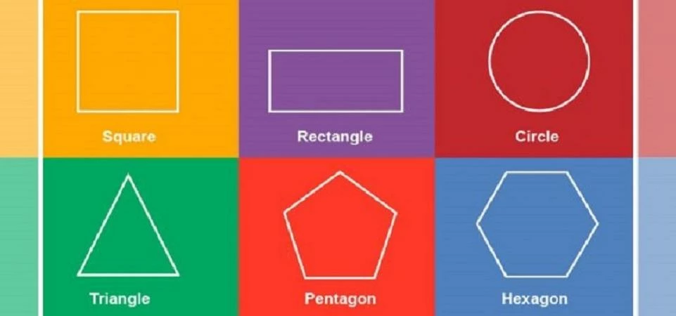
However there is much more to it than simply remembering a shape. The shapes used must carefully and accurately convey the right message. Different shapes such as circles, squares, triangles, curves, horizontal lines, vertical lines and more all communicate a different meaning. The most skilled of designer must combine these shapes and subsequent meanings together to ensure their design represents and promotes a specific message.
Circles
Circles, particularly interconnecting circles, suggest partnership, strength and resilience. This is perhaps no best demonstrated than with the Olympic rings. Its meaning of the five continents coming together in unity is made stronger by the positivity of the never ending circle. If the designer used interconnecting triangles, for example, the logo would communicate a very different message.
Triangles
Triangles have all the energy and danger associated with diagonal lines but in a simple solid structure. They can often be found in logos for religion, law or science to promote a sense of power. They are also regularly found Triangles are often used in logos for companies with a masculine market.
Squares
If you are looking for a solid reliable shape to use within a logo then square is perhaps the best way to go. The use of vertical and horizontal lines creates a perfect balance for demonstrating reliability. Something to carefully consider when using squares though is to not be considered too boring. Without the correct use of colour, shading and other effects then a square can portray dull and a lack of imagination.
Curves
A Curve will tend to create a positive and comforting response. They can stand for emotions such as tenderness, care, friendship, protection and love. Curves also imply movement and are frequently used to resemble a smile to promote happiness in a product.
Diagonal Lines
A diagonal line will explode in to the subconscious mind as logos with lots of diagonals tend to belong to energetic and exciting companies that are keen to make themselves seen and heard. A diagonal lines can give a real sense of dynamism and rapidity. Overusing a diagonal line, however, is a danger as it tends to create a sense of that exactly, danger!
Horizontal Lines
Horizontals lines are often a safe choice for use with a logo. They stand for tranquillity and composure and have a calming effect that can help to soothe. A horizontal line promotes trust and are often used to combat the threat and aggression seen in vertical and diagonal lines.
Vertical Lines
Vertical lines suggest stability, strength, and balance. The precision of verticals also imparts strength and professionalism. They are often used in corporate logos in competitive industries to promote a sense of professional reliability and efficiency. However, vertical lines are often hard to pull off as they can come across as cold, aggressive, domineering, and aggressive. Unless this is what you’re looking for, vertical line-based logos require careful thought.
Some business will have certain messages, values or themes they wish to promote and may find it easier to be naturally drawn to some of the above components when it comes to their company branding. Others, however, may stand for a mixture and see value in using multiple shapes and patterns with their logo. This doesn’t mean either of these ways of thinking are wrong or going to have more or less success than the other – it all comes down to how carefully and creatively the logo is designed.
Next Week: We’ll take a look at how colour plays a significant impact on the design and attraction of a logo.
This was posted in Bdaily's Members' News section by David Elvis .
Enjoy the read? Get Bdaily delivered.
Sign up to receive our daily bulletin, sent to your inbox, for free.
Our Partners


 Why local government is key to devolution success
 Your reputation is worth more than that invoice
 There is no perfect time when selling a business
 What next when social media career help goes?
 The psychological contract that nobody signs
 Time for strategy built on the foundational economy
 Why being ‘work-ready’ matters more than ever
 The North's future doesn't end at Manchester
 Exit or legacy? Why every owner needs a plan
 Who speaks up for SMEs when giants get bigger?
 The true value of HR in an AI-driven working world
 What new business rates guidance means for pubs