Partner Article
How to Set Apart Your Brand with Signage
There are over 5000 ‘high-streets’ in the UK, hosting many of the 275,000 brick and mortarshop fronts. Without a doubt, competition for cementing your brand’s presence on any UK street is fierce. Signage is an easy and effective way to drive traffic and increase your brand awareness, providing you adhere to strategic design and implementation. Fortunately, we come bearing 5 fundamental principles to set your brand apart through your physical signage.
Capture Your Brand’s Individuality
Creating compelling signage that captures your brand’s individuality is one part art, one part science.
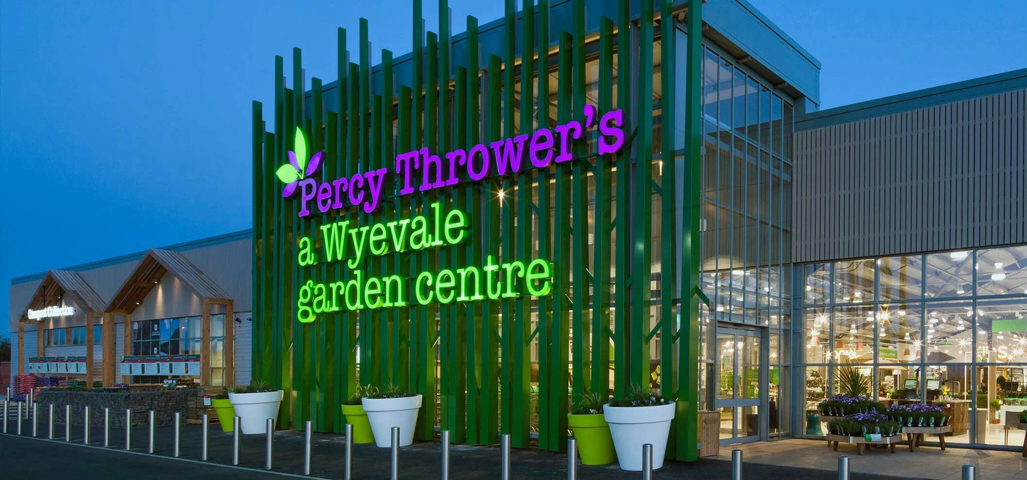
Signage is effective as it transfers powerful feelings and information about your brand in merely a glance. Because of this, it is critical your signage captures to perfection the core values and perceptions you want to convey to customers. First impressions count, and signage is often your customer’s first one.
Effective signage will evoke the personality of your brand and get you talked about, whilst maintaining a clear distinction and uniqueness from that of any other signage in your neighbourhood.
Pro-signage tip: Go undercover. Research your competitors’ signage, taking note of colours, styles and typefaces, to ensure your own signage is unique and distinct.
Big & Bold
Attentions spans are shorter now than at any time in human history. In today’s world of information overload, any business owner or marketing manager knows the difficulty of capturing a would-be customer’s attention. Therefore it should come as no shock that ‘big and bold’ has always been a major characteristic of powerful signage, and is more relevant than ever before.
Your signage needs to project your brand identity across to as many people as possible with minimal complexity. Your customer doesn’t have time to spend trying to read your sign – so simplicity with style, design and colour choices is the way forward.
Pro-signage tip: A bright yellow billboard with white text is almost impossible to read. Trust us.
Dynamic vs Static
Imagine yourself glancing up a busy high-street. Putting aside the movement from shoppers and the road traffic, more often than not a shop front is a static entity. Now, instead imagine one shop window has signage incorporating an element of ‘dynamicity’, or put simply; movement. Think clever use of materials, such as mirrored elements reflecting the bustling high-street, or harnessing the wind through hanging signage. Which shop-front would your attention drawn to – dynamic or static?
Top signage thinks outside the box. A lot of commercial signage will be your straight talking, static billboard signage. But on a competitive street, any advantage in your shop-front visibility can quickly lead to increases in through the door traffic.
Pro-signage tip: Don’t include movement for movement’s sake; ensure that any signage is consistent with your brand. Also, if you’re located in one of the top 10 windiest areas in the UK, seriously, stick with the static signage.
The Three Signage Laws
Visibility: Location, location, location is a phrase often reserved for the property industry. However, this phrase is just as applicable in the signage industry too. Ensure your signage receives maximum visibility through well-thought physical placement. Also consider illuminating your signage to boost your presence with around the clock exposure.
Readability: The clearer your signage, the more likely it will succeed. Remove clutter and strip out unnecessary information. Simplicity ensures you appeal to a wider audience. Just like this paragraph.
Conspicuity: A Newcastle supporter, wearing a black and white striped shirt, would stand out like a sore thumb at Anfield, Liverpool, where most people wear bright red shirts. Effective signage will be this Newcastle supporter. Signage that is distinguishable from its surroundings will be readily discovered by the eye, leading to increased brand awareness and attention.
Why We Consistently Mention Consistency
At Kremer Signs we just can’t stop mentioning the importance of consistency. In fact, aquick google searchreveals we’ve referred to the term “consistency” 173 times online, at the time of writing this article. By the time Google indexes this article, make that 180.
Just like with brand consistency, consistent signage will create an image that your customers can remember and instantly recognise. This doesn’t mean all your signage has to be of the same style, but repetition of key elements such as logo, general design and colour goes a long way towards reinforcing your brands memorability long-term.
Furthermore, for large businesses with multiple offices or shop-fronts, ensuring all branches feature the same signage creates an image of dependability, familiarity and trust.
Pro-signage tip: Consistency is vital in business and signage alike, especially in providing quality products or service. (That wasn’t just an excuse to use ‘consistency’ again, honest!).
A Business with No Sign, Is a Sign of No Business
Strategic design and implementation of signage will not only attract new customers, but makes clear financial sense by driving traffic and brand awareness. Signage that captures your businesses’ individuality, stays bold, follows the three signage laws and maintains consistency will ensure you set your brand apart in today’s competitive marketplace.
This was posted in Bdaily's Members' News section by Kremer Signs .
Enjoy the read? Get Bdaily delivered.
Sign up to receive our popular morning London email for free.
Our Partners


 Why local government is key to devolution success
 Your reputation is worth more than that invoice
 There is no perfect time when selling a business
 What next when social media career help goes?
 The psychological contract that nobody signs
 Time for strategy built on the foundational economy
 Why being ‘work-ready’ matters more than ever
 The North's future doesn't end at Manchester
 Exit or legacy? Why every owner needs a plan
 Who speaks up for SMEs when giants get bigger?
 The true value of HR in an AI-driven working world
 What new business rates guidance means for pubs