Partner Article
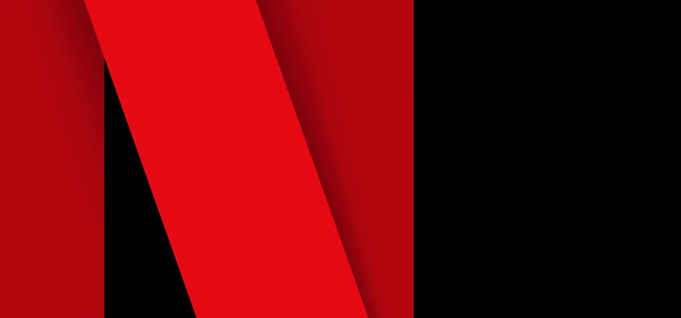
Netflix just updated their logo, it's not good.
We’re not short of logo redesigns in the past 12 months; Uber went all out with a brand new logo & adaptive colours for different markets. Co-op ‘just’ gave their brand a welcome refresh this last month.
Netflix has updated their logo across Facebook and Twitter, and it’s bad.
I don’t usually comment on brands who re-design their look or update their logo, after all, it’s their brand and means a lot to them. The Netflix update has ruffled my feathers. I’ll tell you why.
1) It’s cold
The new update is cold, brash and emotionless. This is a brand all about culture, movies from across the globe and ground-breaking new series. I get a feeling that they’re trying to make a statement, but it’s resulted in a cold and intimidating design that’s not user-friendly.
2) It wasn’t needed
I’m not one to stick with old ways of doing things, and I don’t believe in the saying ‘if it’s not broken don’t fix it’. But, on this occasion I’m not sure it was even in need of an update, the old logo was clear and to the point, it was friendly and welcoming.
3) It’s a copy cat
Poor Netflix is not to know, but they have pretty much copied my favourite online news site: Prolific North. Now, not all design is original, but the design is strikingly similar to a site I read every day. I’ll now have to double check if I’m on Netflix or Prolific North next time I say the big Red ‘N’.
Okay, it’s not a big deal, and so far it looks like it’s just the logo that has been updated. No company will ever get a re-brand right as someone, somewhere will never be happy. It does show, though that when users are engaged, and passionate about a brand; any small change will be noticed.
I love Netflix, and I love Prolific North. Will it stop me watching Netflix? Nope.
This was posted in Bdaily's Members' News section by Mylo Kaye .
Our Partners


 Time for strategy built on the foundational economy
 Why being ‘work-ready’ matters more than ever
 The North's future doesn't end at Manchester
 Exit or legacy? Why every owner needs a plan
 Who speaks up for SMEs when giants get bigger?
 The true value of HR in an AI-driven working world
 What new business rates guidance means for pubs
 Business success starts with people investment
 It's time to confront the digital poverty crisis
 Why a business exit is no longer all or nothing
 Culture is the foundation for sustainable growth
 Business must help young people take root in work