Partner Article
STEELTOWN BREWER PAYS HOMAGE ‘TO THE WORKERS’
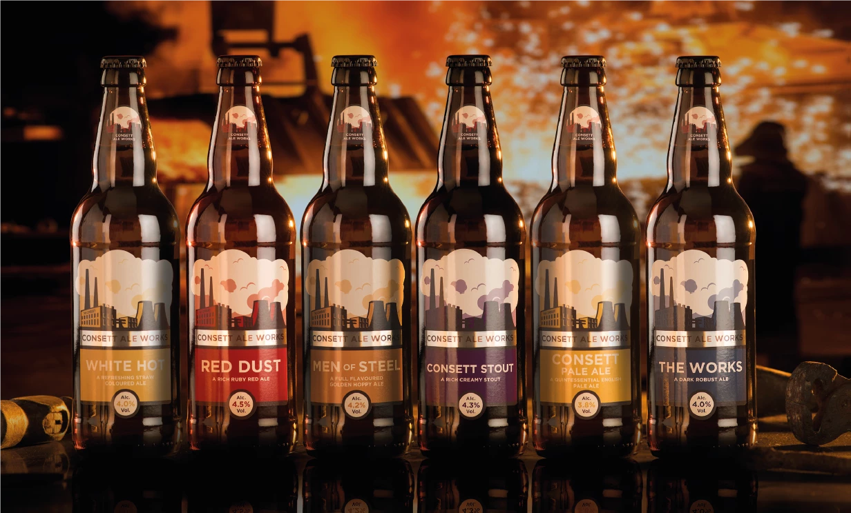
Consett Ale Works, which is based at The Grey Horse pub in the County Durham town, has developed a powerful new brand, which truly reflects the whole ethos of the brewery and the industrial heritage of the North East.
The brand has been implemented across all materials, from bottle labels to glassware, pump clips, packaging, online and vehicle livery.
The inspiration for the brand was originated by local artist Mick Oxley, who worked with Consett Ale Works (CAW) founder Jeff Hind to create an identity, which pays homage to the town and steelworks or, ‘The Company’ which was an integral part of the whole area for decades. The Brand Identity ‘TO THE WORKERS,’ uses the iconic graphic style of Soviet propaganda to depict the dominating image of the steelworks.
Jeff Hind commented on the brand, ‘We wanted to create an identity which reflected the heavy industry which dominated this landscape for such a long time. The importance of these huge factories to the region was matched by the workers who lived here. The workers were proud of the region. We wanted an identity which promoted the strength, authority and raw energy of the region and the amazing people who made the North East such an industrial powerhouse.’
Mick Oxley spent 5 years at school in Consett, and had first-hand experience of living next to the steel works, which dominated the local area. He remembers fondly the red oxide which was part of the sand in the local football pitch, and was the inspiration for CAW’s signature Red Dust ruby ale. Mick commented: ’Consett Ale Works have an outstanding reputation and a wonderful range of beers, which compliment the rich industrial heritage. The branding offered an opportunity to convey the importance of the workers who made ‘steeltown’ such an important place. For those who live in the region now, the new brand offers a powerful nod to our history, and a fitting celebration of the drinks which have survived.’
The initial designs were taken by northern Brand and Design consultancy We are Concept, who developed the identity adding the striking colour palette and taking the propaganda style silhouettes, adding billowing smoke backgrounds, to create a final brand, which could be used across all products and a complete range of mediums.
Dean Rutter, managing consultant at We are Concept commented: ‘We were inspired by the artwork of Mick Oxley. He captured the strength and power of the industrial heritage perfectly. We ensured the design flowed across the whole product range from ruby ale, and selected bitters to stout. The brand works across every medium from digital to livery.’ Jeff Hind concluded: ‘There were many reasons behind the need for a new brand. We wanted a brand which will position us as we continue to grow the business. We wanted a single identity which would bring together the outstanding range of products we have created. Finally, we wanted a brand which reflected our own heritage and provided a sense of our own gratitude and respect to this fabulous region. I believe the new identity has worked on all levels.’
This was posted in Bdaily's Members' News section by Mark Carton .
Enjoy the read? Get Bdaily delivered.
Sign up to receive our daily bulletin, sent to your inbox, for free.


 How to build credibility in B2B marketing
 Is your business ready for the trade union change?
 Government 'must take its foot off businesses' throats'
 Upskilling key to civil engineering's future
 Why apprenticeships are becoming a strategic asset
 Business growth requires the right environment
 OpenAI decision a wake-up call for our tech plans
 Understanding the new Employment Rights Act
 Why global conflict is a cyber risk for UK SMEs
 Improving safety and standards in construction
 From economic engine to community ecosystem
 Improving North East transport will improve lives